Colour Grades to inspire your next film project
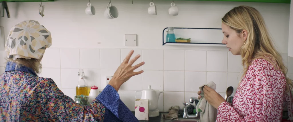
While modern colour grading offers vast possibilities, I believe a truly impactful look is best achieved when planned out before filming begins. The selection of a colour palette for costumes, set design, lens choice, film stocks, and even sensors all significantly contribute to the overall ambiance of your film. These foundational choices lay the groundwork, allowing enhancements in colour and tone to be skillfully refined during the grading process.
A few years ago I made my own short film and planned out the visual aesthetic I aimed to achieve. Despite operating on a micro-budget, I maximized pre-production efforts to lay the groundwork for realising my vision in post-production. Notably, I chose to shoot with a relatively recent Canon camera but opted for vintage lenses to impart a softer, less digital essence to the visuals. These lenses, predominantly old Zeiss photo lenses procured second-hand, were ingeniously adapted to the Canon EF mount via adapters.
Colour palettes are another good example to consider when planning certain scenes or environments you may be filming in.
Certain colours will influence a characters personality or state of mind. Light and shadow are also key in setting mood or creating tension.
There is an abundance of apps available that break down a shot’s color palette. These apps can serve as great sources of inspiration for your own projects.
Apps like Adobe Colour, Pantone Studio, Colortone Maker and Coolors which I used to generate the stills below.
COLOUR INSPIRATION FOR YOUR NEW PROJECT
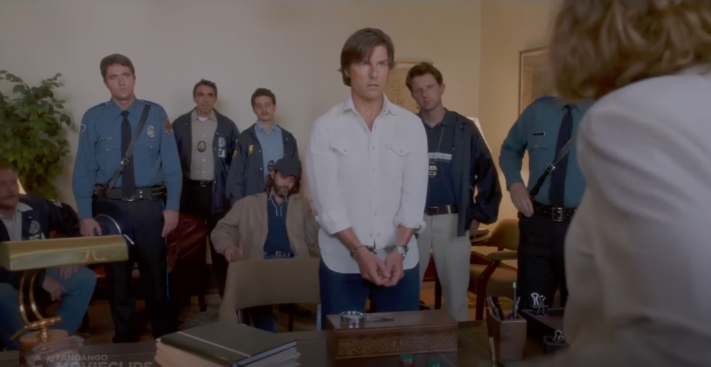
American Made Colourist – Rob Sciarratta
Emulating film stocks of the 80s. Warm highlights and muted tones with a softness to the image. All helped by great costumes, production and set design. A slight warming of the highlights and whites in the colour grade is a good starting point for this look.
Blade runner 2049 Colourist – Mitch Poulson
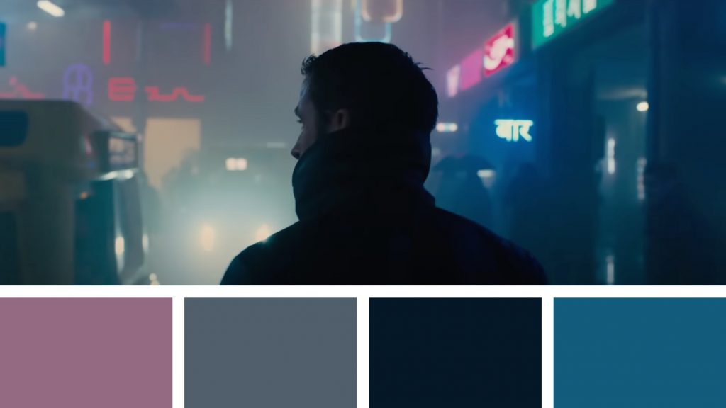
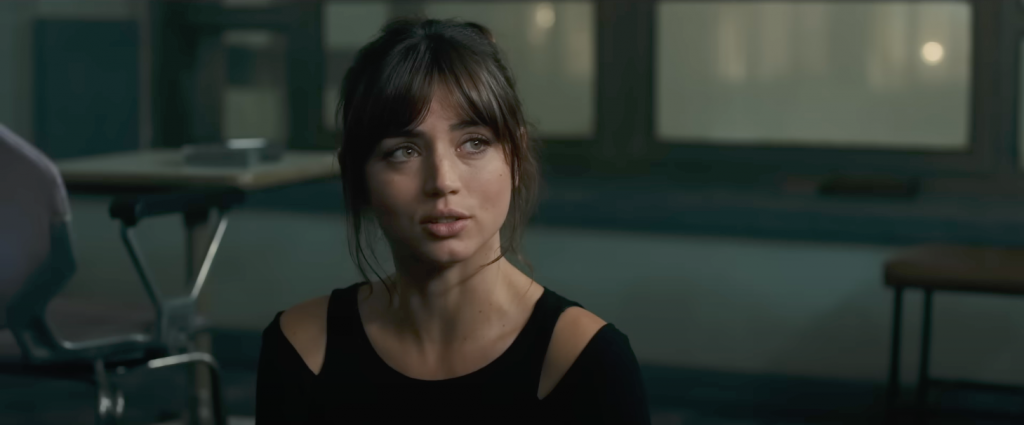
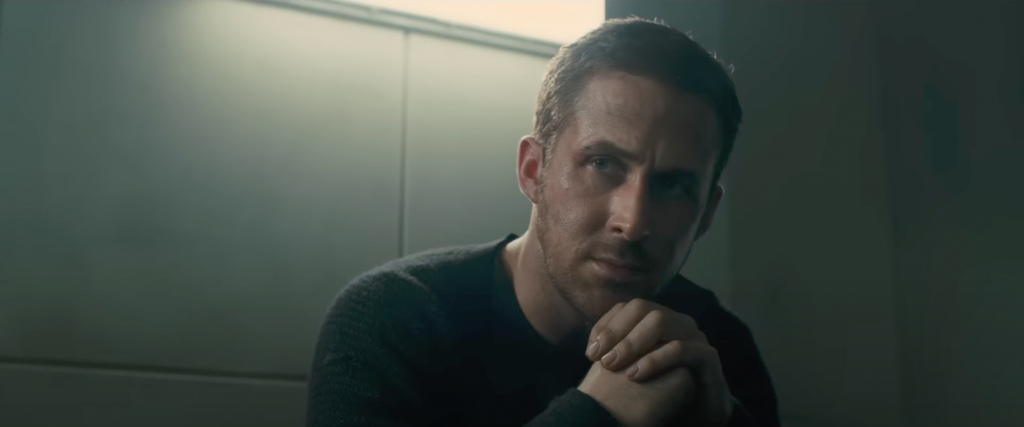
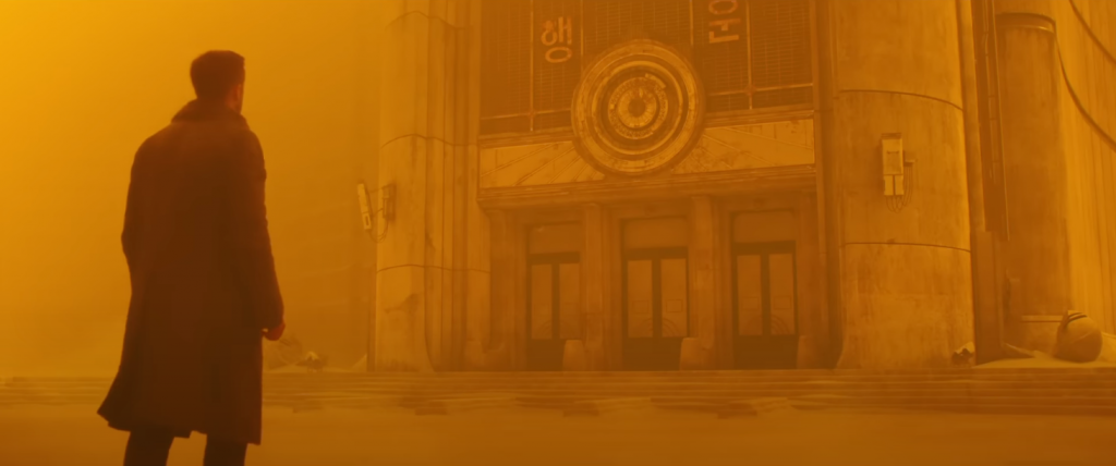
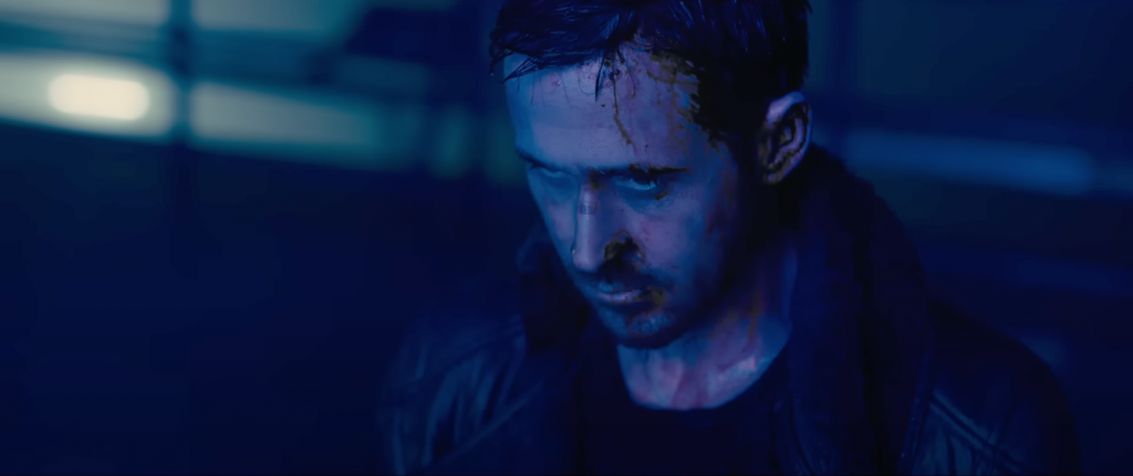
Like the original so much of the Bladerunner 2049 is outstanding in term of cinematography and Colour Grading. The combined excellence of Roger Deakins camera and Mitch Paulsons colour grade work is top tier.
A great example of colours portraying a mood for an environment. Also acknowledging the protagonist being not human, cold and efficient. The apartment is sparse and utilitarian. A palette of blues representing this steely small room. Even the skin tones are quite flat and almost lifeless.
Strong use of single colour for these two shots. The sandy yellow environment portraying a large open space like a desert but is a ruined forgotten cityscape. Evokes a sense of loneliness and isolation.
The heavy contrast of shadows and blue/magenta implies a tense more claustrophobic atmosphere. Also helped by the tight framing of the actor. Now building to a climax in the film.
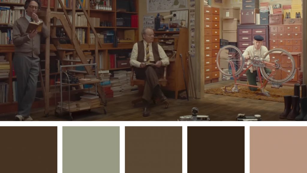
The French Dispatch Colourist – Gareth Spensley
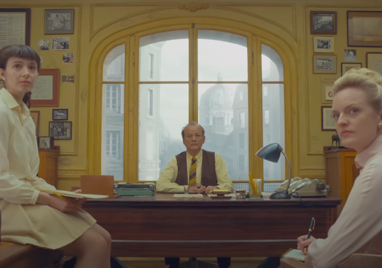
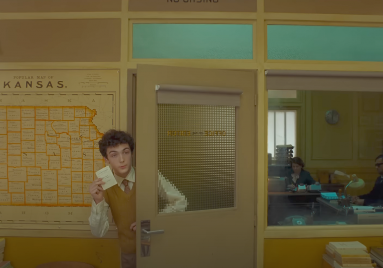
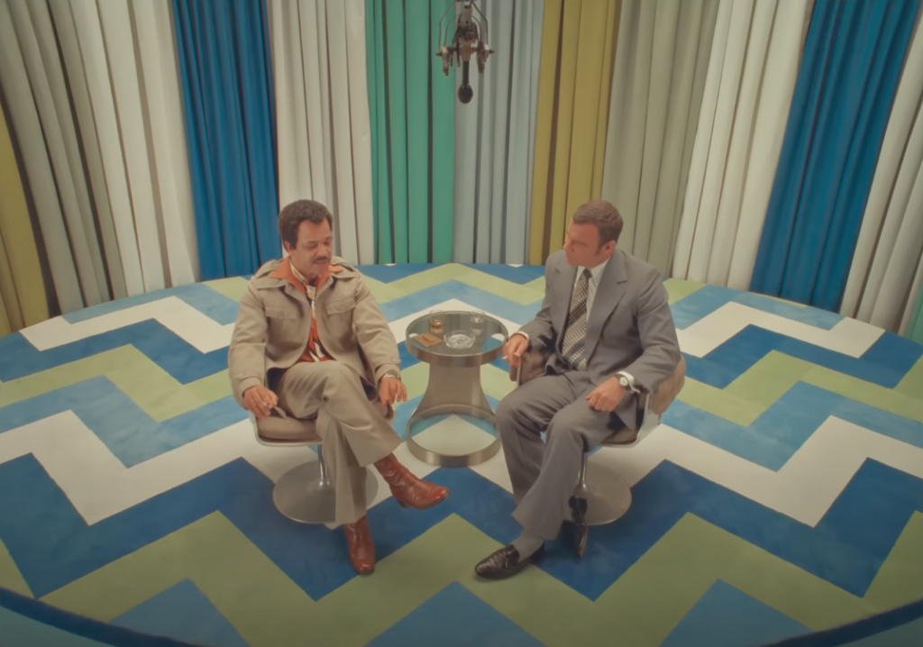
The chat show set is again precisely colour coordinated. The carpet stripes are matching the curtains.
The guest and hosts grey suits are again using colours found in the set.
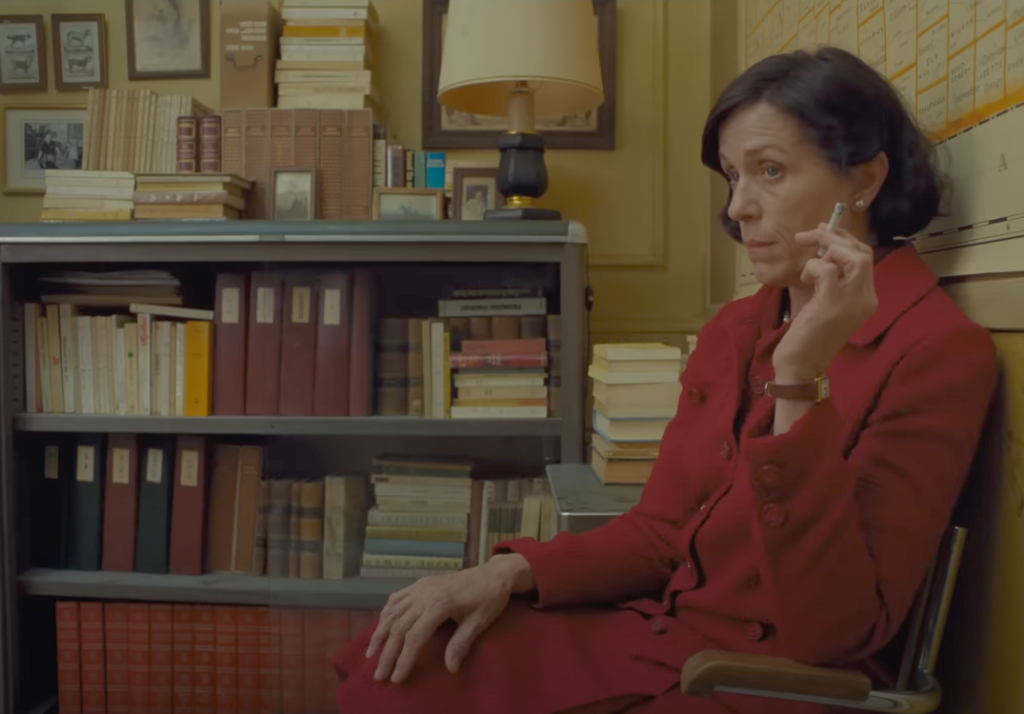
Here we have the yellow and beige set again but with the addition of rusty reds and browns. The books and coat are again in a similar colour palette. The coat is slightly more saturated making your eye focus on the actress first.
Black Spot 2017-19 (Zone Blanche) Colourist – Olivier Ogneux
“Black Spot” was a French TV show situated in the fictional town of Villefranche.
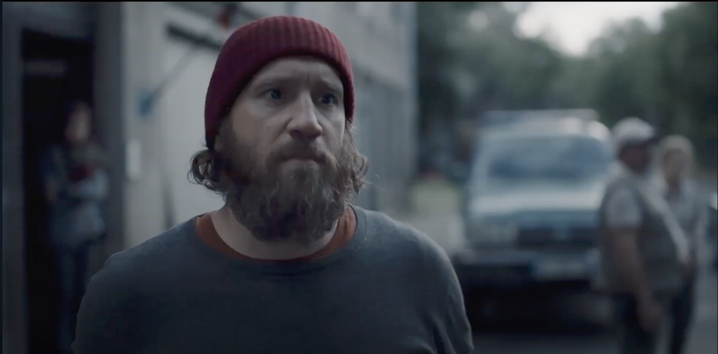
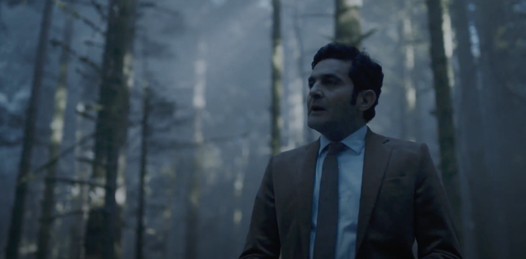
The eerie and mysterious essence of the series provided the creators with an opportunity to instill a distinctive look and feel.
They achieved this by employing strong contrast and a muted color palette, enhancing the mood and atmosphere throughout.
The majority of exterior sequences appeared to unfold in an eternal misty dusk or twilight, with greens, browns, and reds dominating the costumes and sets. The slightly washed-out, soft appearance was likely crafted during the grading and post-processing stages of production.
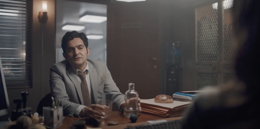
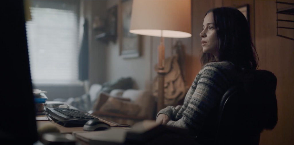
Warm, dimmed practicals predominantly illuminated the interiors, casting soft shadows on the cast and evoking an almost ’70s-esque style, as illustrated in the two shots below. Once more, the set colours complemented the costume choices, enhancing the scenes’ emotion and atmosphere.
In conclusion try looking at the shot in terms of not just the colours and how you think of the grade was manipulated but as a whole series of components. The ideas behind lighting, costume choice and set design colours. All making up a stronger image and one that can help motivate a scene to a higher level of emotion and inform the colour grade.
I hope you found this article useful and If your interested in finding out more about these films and tv shows here are their IMDB pages.
The short film I mentioned that was made back in 2017 can be viewed here on Vimeo.
